
Kernels
Building the design system that unified Hy-Vee's digital products.
Intro
Role
Initiator
UX Strategist
Lead Designer
Status
Live
2024-2026
Type
Web
iOS
Android
Design System
Multi-product
SaaS
Tools






The Challenge


The Need for a Shared Foundation
My Role


Process
01
Discovery
Understanding the Ecosystem Before Building It
Before defining Kernels, I set out to understand the entire design ecosystem at Hy-Vee. I audited every existing design system—including the legacy internal library, Razorfish's system for Seasons, Capillary for RedBox Rx, and other product-specific implementations—while collecting design files, live UI, component references, and implementation details into a single Figma workspace. By mapping patterns, inconsistencies, and technical dependencies across platforms like Sanity CMS and AEM, I established a clear foundation and roadmap for building a design system that could unify products and scale across both design and engineering.
Discovery wasn't about finding components—it was about understanding how an entire organization designed, built, and shipped digital experiences.


02
Defining and Planning
Defining the Foundation
Discovery helped us understand where we were. The next step was defining where we wanted to go. Through continuous collaboration with product and design leadership, I aligned stakeholders around a shared vision for Kernels and developed a phased roadmap for its evolution. To ensure the system followed proven best practices, I studied established design systems such as Shopify Polaris, Carbon, Material Design, Ant Design, and Salesforce Lightning, while deepening my expertise in Figma variables and scalable system architecture. Rather than building components first, I established a strong foundation—colors, typography, spacing, iconography, layouts, and grids—before progressively designing atomic components, reusable patterns, and composable building blocks that could scale across products and CMS-driven experiences.


Iconography
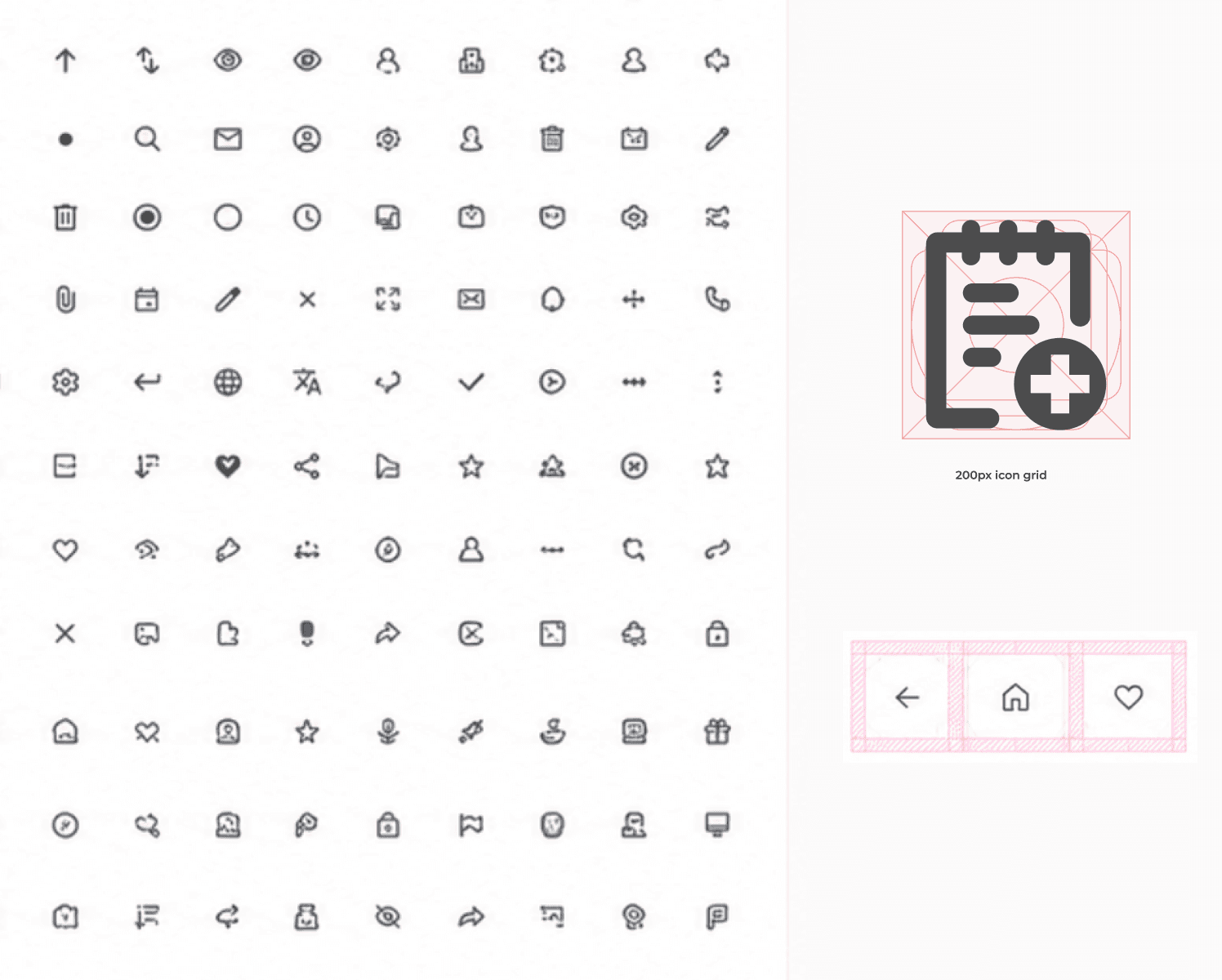
Although Kernels initially adopted the icon library from Razorfish, I discovered that it lacked a consistent visual language. Icons varied in their sizing, bounding boxes, stroke weights, and scaling behavior. While a mix of outline and filled icons was intentional for certain use cases (such as stars and checkboxes), the overall library lacked clear standards for creating and maintaining icons.
I led the initiative to rebuild the icon system from the ground up. Working closely with the Platform team and design leadership, I designed over 150 master icons, established a unified icon grid, defined stroke and sizing rules, and documented the guidelines for future contributions. This transformed the icon library from a collection of assets into a scalable design language.
The impact extended beyond design. Instead of exporting multiple PNG assets for different sizes, developers could now consume a single SVG per icon, allowing it to scale seamlessly across products. This significantly simplified handoff, reduced engineering effort, and created a more maintainable workflow that was widely adopted and appreciated by both design and engineering teams.


03
Design & Document
Building the System
With the roadmap in place, we began transforming the foundations into reusable building blocks. Working closely with another designer and collaborating early with the platform engineering team, we validated decisions as components evolved, ensuring they were both scalable in design and practical to implement. We started with foundational elements such as buttons and their variants before expanding into alerts, badges, chips, form controls, and many other reusable components that became the building blocks of Hy-Vee's digital products.
Accessibility by Design
Accessibility wasn't treated as a final review—it was built into the process from the beginning. While defining the design foundations, I continuously validated color palettes and semantic tokens to ensure appropriate contrast without compromising the Hy-Vee brand. As the component library matured, we partnered with the accessibility team to review each component against accessibility standards, refining interactions, states, and behaviors before they became part of the shared system.
Documentation as a Product
Documentation evolved alongside every component rather than becoming an afterthought. Each pattern was first documented within Figma, capturing usage guidelines, behaviors, variants, and implementation considerations. As Kernels matured and engineering adoption increased, the documentation expanded through real product discussions, edge cases, and evolving best practices. What began as design documentation gradually became a shared knowledge base in Confluence, with early exploration into Zeroheight as a dedicated home for a growing enterprise design system.


04
Governance
Maintaining the System
As Kernels evolved beyond a component library, governance became essential to maintain quality and consistency. Every new component or enhancement follows a structured review process, beginning with UX proposals and progressing through design validation, accessibility checks, documentation, and a scheduled release cycle.
With a small team of dedicated maintainers, strict ownership, versioning, and publishing standards ensure the system remains reliable as it scales. Deprecated components are archived in a dedicated Graveyard library to preserve design history while keeping production libraries clean.
Documentation is maintained alongside every release—Figma for component definitions and usage, Confluence for cross-functional collaboration, and Zeroheight as the long-term destination for a unified, enterprise-ready design system.
Deprecated components weren't deleted—they were archived to preserve the evolution of the system.

Result
Products Powered by Kernels


What began with foundational components gradually expanded into full product experiences. My Prescriptions became the first mobile application built extensively on Kernels, followed by Aisles Online, the Hy-Vee app, Hy-Vee.com, and several internal employee tools. The design system also influenced external platforms such as RedBox Rx, proving its flexibility beyond a single product ecosystem.
Adoption & Scaling
Adoption
Designers were encouraged to use Kernels from its earliest stages, even before the library reached maturity. As adoption increased, Kernels eventually became the default design library attached to every new Figma file across digital products.
Engineering Buy-in
As more products relied on shared UI patterns, engineering teams began requesting production-ready components. Working alongside the Platform team, we evolved Kernels into a designer and developer system, ensuring components behaved consistently from design through implementation.
Scaling Forward
The long-term vision extends beyond components. Planned initiatives include page templates, themes, design modes, richer documentation, AI-assisted workflows, and a dedicated cross-functional Kernels team with office hours to continuously refine the system.
Impact
Organizational Impact
Instead of repeatedly recreating UI, designers now assemble experiences using production-ready building blocks. This reduced repetitive work, simplified design reviews, improved consistency, and allowed teams to spend more time solving user problems rather than rebuilding interfaces.
Engineering Impact
A standardized component library significantly reduced implementation ambiguity. Designers no longer exported multiple asset variants for every state, while engineers benefited from reusable, predictable components that accelerated development and reduced maintenance overhead.
The redesigned icon system replaced multiple raster exports with a single scalable SVG source, simplifying both design maintenance and frontend implementation.
AI-Ready by Designg Forward
Standardising component metadata, variables, and documentation across the design system, transformed Kernels into a reliable foundation for AI-assisted product development. Connected to Claude, it enables cross-functional teams to translate natural language prompts into prototypes that align with Hy-Vee's product standards, reducing the gap between ideas and implementation.


Kernels has reached a point where the majority of production UI can be assembled using standardised components. The next chapter is evolving it into a fully integrated enterprise design system with templates, themes, AI-assisted workflows, governance, and dedicated ownership—creating a single source of truth for both designers and engineers.
Testimonial
"We would not have a design system at Hy-Vee if it wasn't for his hard work."
-Nicholas Suddarth
Senior UX Manager, Hy-Vee
…"What stood out most was his initiative. Without being asked, Biswa identified that our legacy icon library (150+ icons!) was inconsistent and hard to read, and took it upon himself to redesign the entire set with a new style he developed from scratch."
-Holden Greenberg
UX Designer, Hy-Vee